
Data visualization stands as an essential tool in the modern world because it enables people to make decisions through clear information sharing. Data visualization is more than just charts. All users from experts to beginners should use data visualization to communicate powerful educational insights from their data stories. For anyone developing a visualization—whether you’re a newcomer or a seasoned data analyst—these questions are top-of-mind because you want to make it great. If they’re done well, visualizations tell an interesting story.
Table of Contents
The following article presents a guide of 10 fundamental data visualization principles that enable you to transform raw data into effective insights. These guidelines will help you create clear, attention-grabbing visuals, no matter what tools you use.
Let’s get started!
What Are the Top 10 Data Visualization Best Practices?
Everyone wants their Business Intelligence (BI) and analytics tools to develop useful insights from data sources. The following section explains methods that help improve your data visualization performance while achieving clear communication results.
1. Define the Purpose and Audience
How well your data visualization succeeds depends on understanding what your audience needs to be coupled with their preferred visualization methods and their expected outcomes. By designing visuals according to their specific needs, the audience will understand your message together with seeing your presentation.
It is a mistake to attempt to design for all potential audiences at once. Successful data visualization depends on grasping who will view the designs.
Ask yourself these critical questions:
- Who will see this visualization?
- What decision should they make?
- Which specific step requires the audience to perform?
Focusing on these points will help you create visuals that connect with your audience and drive results.
2. Choose the Right Chart (And/or Graph) Type
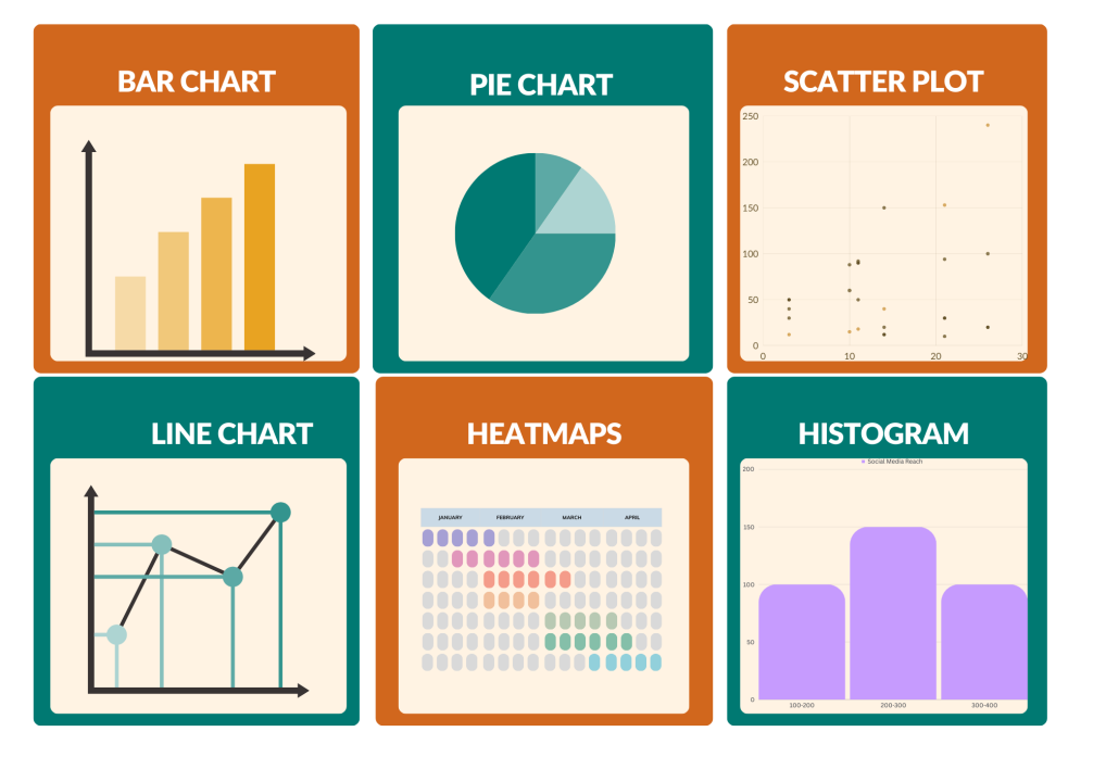
Effective data presentation stands equally vital to data analysis within the extensive data analytics domain. Different charts or graphs act as fundamental factors that determine how effectively your data story will be presented to your audience.
- Bar Charts: One of the most popular visualizations, they represent an extremely common visualization because they enable researchers to show category comparisons across one specific measure. Bar charts come in handy for presenting data that needs to be shown in separate distinct groups.
- Pie Charts: While pie charts are great for adding detail to other visuals, they’re not ideal on their own. Data experts often advocate for avoiding overuse, as they can be misleading when not used properly.
- Scatter Plots: The interaction between two variables appears in scatter plots which present direct connections between them, showing how one influences the other. They’re great for identifying correlations, patterns, or outliers in your data.
- Line Charts: The line graph connects several distinct data points, presenting them as one continuous evolution. The result is a simple, straightforward way to visualize changes in one value relative to another.
- Heatmaps: Use color to highlight patterns, trends, and anomalies in large datasets, ideal for comparing multiple variables.
- Histograms: Histograms visually represent data distribution, allowing viewers to spot numerical clusters and evaluate category comparisons. Therefore, they provide a summary of point distribution.
3. Focus On Data Storytelling
Data storytelling is about transforming numbers into a captivating narrative that resonates with your audience. By presenting data as a story, with visuals as key elements and your message as the central theme, you make complex information easier to understand and more engaging. Your audience will grasp data points deeper with this approach to develop enhanced insight into the information which becomes more impactful.
Your data needs to emphasize both the “why” elements and “how” components present in the numerical data. Why does this data matter? Does this information create any impact on the larger scheme of things? Through a structured presentation with introductory and final sections, you can lead viewers through data sets so they can relate better to it for application purposes.
Good data storytelling engages your audience, helps them see trends, and ultimately inspires informed decisions.
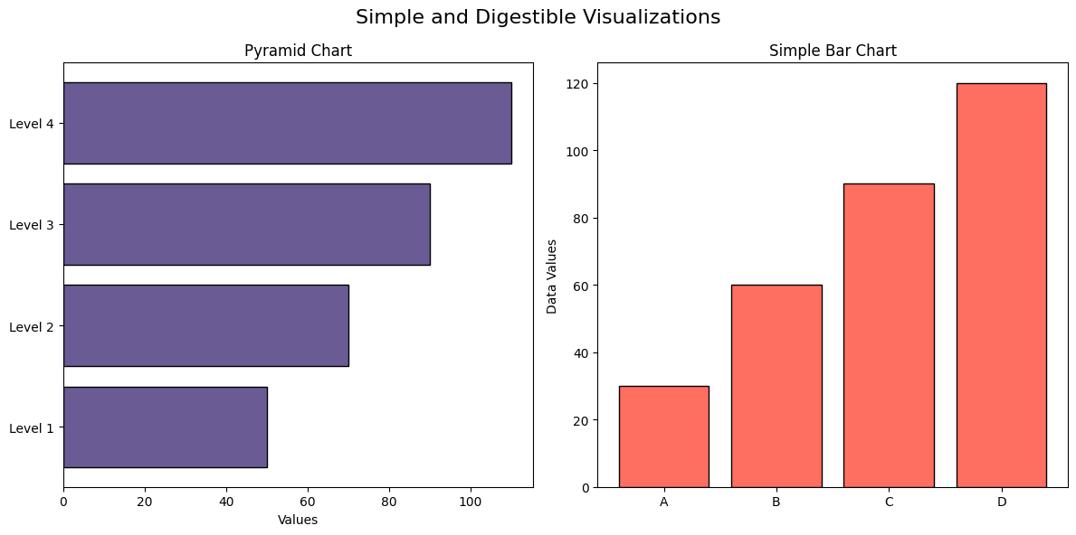
4. Keep Your Visualizations Simple and Digestible
Similarly, content marketers develop “snackable” content, so your data visualizations must be quick to devour at a glance. The best dashboards present the most important information in an instant, with users having an easy-to-grasp overview and being able to drill down where necessary.
Overcomplicated graphics can confuse your audience and create decision paralysis. They consume time and lower productivity, eventually resulting in lost opportunities.
Rather than loading too much information into a single dashboard, concentrate on the most important information. Remove distractions and make your graphics simple and concise. This will enable your audience to quickly get the answers they are looking for and make better decisions.
5. Highlight Key Insights
One of the most effective methods I employ while creating dashboards is to highlight important insights. With conditional formatting, I can highlight the most significant data points, making it easy for users to identify key information. This not only allows your audience to immediately grasp the major points but also facilitates quicker, better-informed decision-making.
For example, in the bar chart below, I’ve highlighted the sales figure for Sarah Lee, the top performer, making it clear that her team contributed 45% of the total sales.
Bar chart with highlighted key insight: Sarah Lee’s team at 45%
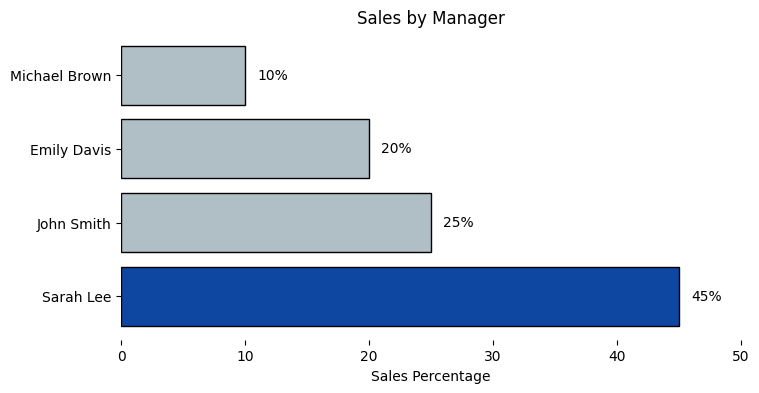
By bringing attention to such key insights as this, you allow your audience to easily take in the most pertinent information, resulting in more concise action points and better decision-making.
This makes it easier to simplify complex data and provide a clearer, more effective message.
6. Tell Data Stories Quickly with Clear Color Cues
Color is a strong ally in data visualization. It can emphasize key insights, point out certain data points, and lead the viewer’s eye. Yet, to effectively use color, balance is necessary. Too many colors overwhelm, and too few cause significant data to become indistinguishable.
When selecting colors, keep in mind the natural connotations your audience is likely to perceive. Red is usually considered to be hot or a warning, and blue is cool and peaceful. When graphing temperature data, employing different shades of red and blue can cause your audience to understand trends and outliers immediately.
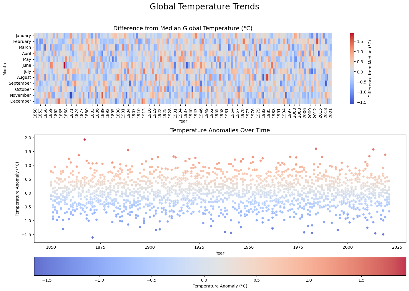
Example:
In the figure below, the heat map employs a blue-to-red gradient to indicate temperature variation. The color scheme is intuitive, and it is easy for the audience to comprehend temperature anomalies over time at a glance.
7. Apply Text Carefully and Intentionally
Text can be incorporated into your visualizations, but use it sparingly and strategically. Too much text is overwhelming to the viewer, but strategically added text highlights key findings and guides your audience.
- Highlight Key Info: Place important information at the top or top left where the eye naturally goes.
- Keep It Simple: Keep the text concise to prevent clutter and maintain focus on the message.
- Group-Related Elements: Use subtle borders to group related filters or categories. Encourage Interaction: Recommend interactive spaces to enable user discovery.
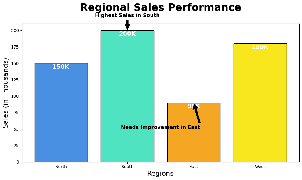
Example:
The next bar chart indicates regional sales performance. Bold labels emphasize key observations, such as the South having the best sales (200K) and the need to improve in the East (90K). Arrows help guide the reader’s eye to important insights easily.
8. Use Predictable Patterns for Layouts
Humans are naturally attracted to patterns and react to images that deliver information rapidly. If data visualization is exhibited in a sequential fashion—numeric, alphabetical, or sequential—then it aids comprehension. Maintaining alignment with cultural reading patterns, like left-to-right in most cultures, ensures a fluid sequence. Having a uniform design in several graphs ensures observers can connect discoveries without becoming disoriented. An organized layout engages the audience and efficiently delivers important messages.
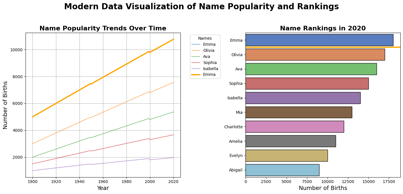
The visualization employs a simple design where a time-based line graph is positioned on the left and a ranking bar graph on the right. Using a bold orange line and marker to highlight “Emma” gives immediate insight and a simple visual flow.
9. Avoid Pie Charts
While pie charts are capable of effectively illustrating the contribution of several segments to a total, they will always fall short in terms of presenting useful information. Areas or angles cannot be distinguished, especially for numerous segments or very thin slices, leading to a disorganized and confusing visualization.
Rather, employ these alternatives:
- Donut Charts: These minimize issues of angle comparisons by highlighting the arc length.
- Line Charts: These are best for demonstrating trends over time and providing a better overall impression than several pie charts.
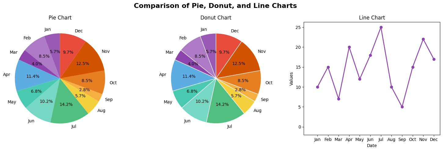
In the majority of cases, line charts provide a better and less confusing view of data than donut or pie charts.
10. Test and Iterate Your Visualizations
Creating effective data visualizations is an ongoing process. Before finalizing, test your visuals with different audiences to ensure clarity and accuracy. Look for any confusion, misinterpretations, or areas that need improvement. Gather feedback from stakeholders, colleagues, or end users to refine your charts, graphs, and dashboards. Small tweaks—such as adjusting colors, labels, or chart types—can make a big difference in readability and impact. Also, consider testing on different devices to ensure accessibility. Regularly updating your visualizations based on new data and insights will keep them relevant and useful for decision-making.
To enhance your visualizations, you can explore the best data visualization tools in 2025.
Why Are Data Visualization Best Practices Important?
- Enhance Clarity: Well-structured visuals simplify complex datasets, allowing viewers to grasp key insights quickly without confusion.
- Improve Decision-Making: Precise and accurate visualizations enable decision-makers to make decisions based on facts since data is not compromised.
- Boost Engagement: An elegant and accessible design maintains focus and keeps individuals engaged longer.
- Emphasize Storytelling: Visuals make data more engaging, and stories, trends, outliers, and patterns are more easily told and identified.
- Maintain Consistency: Uniformity in design language throughout charts and graphs ensures a seamless viewing experience and helps convey the message.
- Drive Better Strategies: By presenting information in an easy-to-digest manner, companies can find opportunities, discover threats, and develop data-driven strategies.
Real-World Examples of Effective Data Visualization
Business Intelligence Dashboards
Firms such as Google and Microsoft utilize Google Data Studio and Power BI interactive dashboards to chart sales performance, track KPIs, and measure market trends. Real-time data are examined in dashboards that assist in making business decisions promptly with all the facts at your fingertips.
Public Health Data
During the COVID-19 pandemic, Johns Hopkins University created a global dashboard to present infection rates, recoveries, and vaccine information. The open and dynamic maps enabled governments, scientists, and the public to be informed and respond accordingly.
Conclusion
Successful data visualization is an essential skill in today’s data-driven world. With best practices, you can transform raw data into clear, insightful, and compelling visuals that effectively communicate with your audience. Whether you’re creating business intelligence dashboards, public health data visualizations, or research presentations, prioritizing clarity, simplicity, and storytelling can make your visualizations not only informative but also effective. By applying these visualization tips, you empower your audience to make faster, data-driven decisions—driving success and innovation in any field.
To streamline your data visualization process and ensure seamless data integration, consider using Hevo. With its automated data pipeline capabilities, you can effortlessly sync, transform, and visualize your data in real time. Sign up for a 14-day free trial to experience Hevo’s unbeatable pricing and powerful features firsthand.
FAQs
1. What are the best practices of data visualization?
Best practices are to understand your audience, choose the right type of chart, be concise, emphasize the key points, be consistent in color and design, and have storytelling. With these practices, your visualization will communicate the data.
2. What are the 3 C’s of data visualization?
The 3 C’s are Clarity, Consistency, and Context. Clarity simplifies the visualization to be comprehensible, consistency offers homogeneity in the design, and context offers the required background information to enable the audience to interpret the data appropriately.
3. What are the four main goals of data visualization?
The four main sections are setting the context, presenting the data, highlighting key insights, and driving action. These phases walk the viewer through the visualization, from raw uninterpreted data to a narrative that educates and inspires action.
Share it with your connections.
-
 Share To LinkedIn
-
 Share To Facebook
-
 Share To X
-
 Copy Link